

Before starting any of the design processes we need to comprehend the website’s purpose. We also need to do our own investigation, Certainly in close collaboration with the client.
understanding these questions to kickstart the design process is necessary:
- Who is the site for?
- What exactly audience expect or look for?
- Is this website’s primary aim to inform, sell, or amuse?
- How do you want to stand out from the competitor sites?
- Are there any websites with designs that you like? Why?
After figuring all this basic information out, We’ll start these steps:
- Inspiration
- Ideation
- Sitemap
- User-Flow
- Wireframe
- Mockup
- Prototype
- User Test
- Design system
- Go live
Here is a good sample to see how proper execution of the design process makes your design to epic one:
1. Inspiration
As a UI designer, we always need to be creatively and trendy but it might be so difficult to have new ideas for each project without getting inspired by the other trendy websites’ designs. We need to collect an organized list of related websites that we’ve chosen, It helps us to accelerate the getting inspiration process. In this stage, we need to see many samples to be aware of the path we have ahead.
Just try not to borrow too much from direct samples, we mustn’t look like a second-rate version of something else.

Let’s look at some popular inspiration websites:
2. Ideation
In this step, we exactly know about:
– What audience look for.
– What are competitor sites offer.
– What design styles are trendy in the related field.

Now, we are ready to do ideation. So, we need somewhere to implement our brainstorming. FigJam is the best platform to expand your ideation even with your project members.
3. Sitemap
Before doing anything about our design process, We must demonstrate what did we get from our project research that will be shown by sitemap.

A visual sitemap is, as the name suggests, very visual. This is a user-focused sitemap to illustrate the website structure in a way that is incredibly easy for people to understand. Visual sitemaps are helpful for many reasons but are particularly useful for site planning.
Also, you can use the pre-made wireflow kit for accelerating your design:
The easy way to create a sitemap is using these websites:
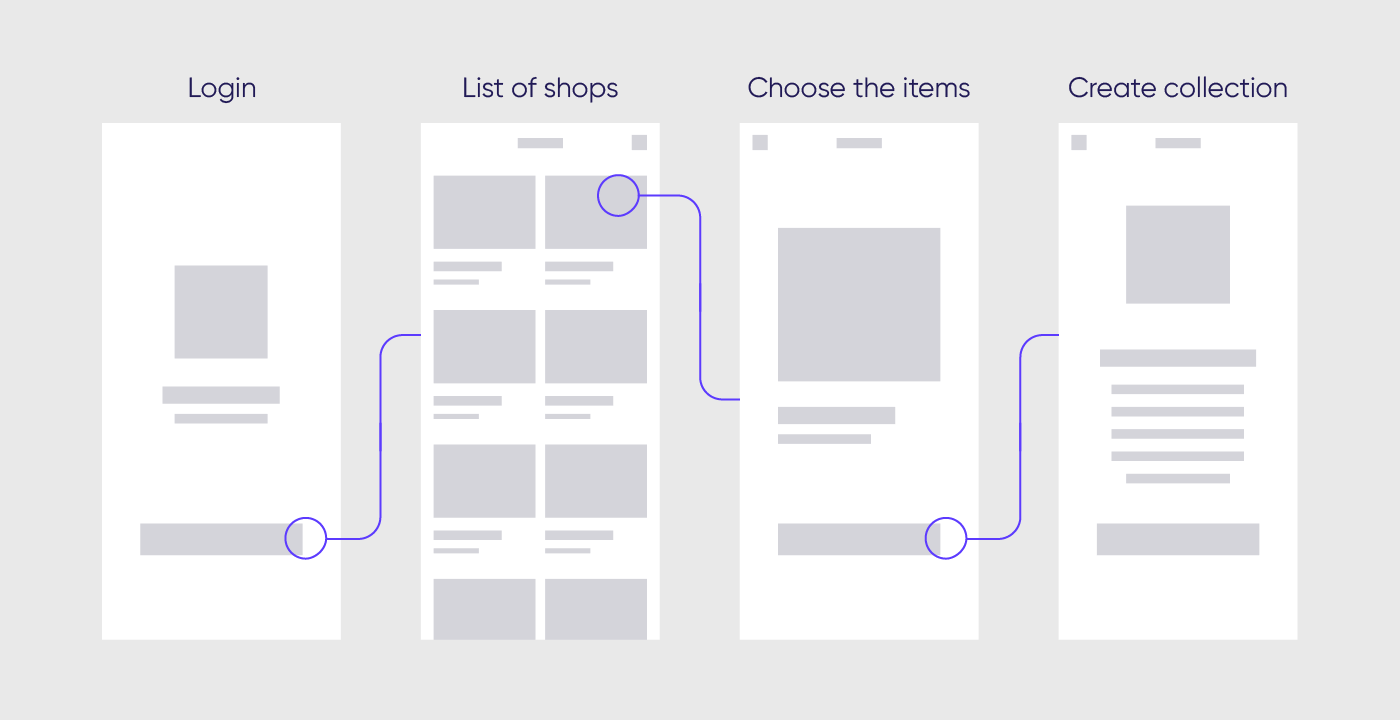
4. User-Flow
After creating Sitemap we need to show the routes we can take to go from point A to point B, And this is possible with user flow diagrams.

In a user flow, the user follows a path through a product that includes their decision points. User flows differ from flowcharts in that they can start off pretty simply to determine key user journeys, but they can easily lead to more complicated flows by adding all the different decisions a user can make.
Understand your user. In order to design the best possible user flow, you need to understand your user the best you can. When deciding how to get users to interact with your product in a flow-like state, understanding the user’s needs and motivations allows you to make an informed choice.
The easy way to create a user flow is using these websites:
5. Wireframe
In this stage we have to turn our thoughts to the initial website framework through three steps of wireframing:
- “Low-fidelity wireframes”
Low-fidelity wireframes are ideal if you’ve got stakeholders or clients in the room and you want to sketch something up with a pen mid-meeting.

- “Mid-fidelity wireframes”
The Mid Fidelity wireframes have more comprehensive and realistic components of UI, But if you have no enough time for every each design process you can just skip this substep.
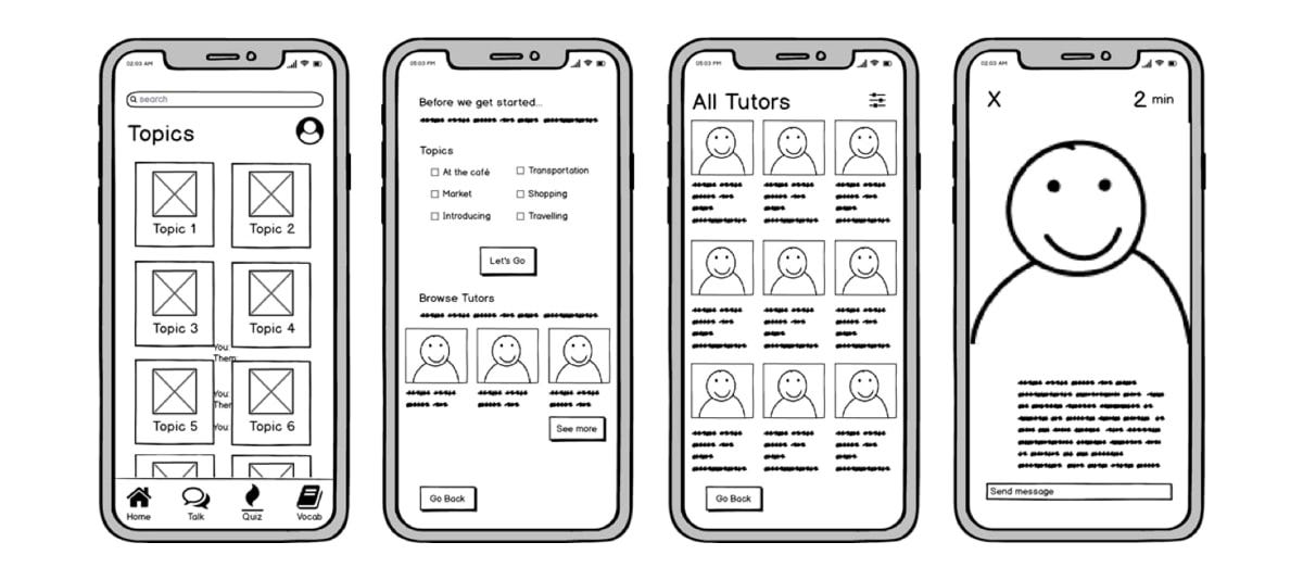
- “High-fidelity wireframes”
Finally, high-fidelity wireframes boast pixel-specific layouts. Where a low-fidelity wireframe may include pseudo-Latin text fillers and grey boxes filled in with an ‘X’ to indicate an image, high-fidelity wireframes may include actual featured images and relevant written content.

Here are free Wireframe tools:
- Figma
- InVision
- Draw.io
- Miro
- Wireframe.CC
- MockFlow
- Jumpchart
- Framebox
- Mydraft.CC
- Wirefy
6. Mockup
Mockups are the next phase after wireframes when high-fidelity sketches become fleshed-out website designs. A mockup takes the fundamental layouts from the wireframe and adds content, branding, and styling. It’s also here that designers will receive feedback from stakeholders and iterate on their mockup designs before continuing to prototypes.

Here are some design tools we should consider for our mockup phase and beyond:
- Figma
- Adobe XD
- Invision Studio
- Sketch
7. Prototype
In prototyping, the mockup is converted into an interactive demonstration of the website. While not the final coded website, a prototype simulates a website’s look and behaviour as closely as possible. Designers use prototypes for user testing to receive valuable feedback about the site’s usability.
There are a lot of tools out there to help you create your website prototype:
- Figma
- Invision Studio
- Origami
8. User Test
Now, It’s time to get feedback from users. We must test our prototype with different user groups, conduct usability tests and create user stories.
User testing is a process of verifying that a solution works for the user.
Also, we can take user tests among each process step to get better and ideal results.

Some of the user testing tools:
- Invision Studio
- Google Forms
- Marvelapp
9. Design system
And the end up when our design is working well we should create a visual design language. The visual design language is the core of a design system. It’s made up of the discernible components that you’ll use to construct your digital product. Your visual design language is made up of four main categories, and you should consider the role each of these design elements plays in every component on the screen.

- Colour
Common colours in a design system include 1–3 primaries that represent your brand. You may want to include a range of tints — a colour mixed with white — and shades — a colour mixed with black — to give your designers a few more options. - Typography
Most design systems include just 2 fonts: 1 font for both headings and body copy, and a monospace font for code. Keep it simple to avoid overloading and confusing your user. Keep the number of fonts low; it’s not only a best practice of typographic design, and it also prevents performance issues caused by excessive use of web fonts. - Sizing and spacing
The system you use for spacing and sizing looks best when you have rhythm and balance. A 4-based scale is growing in popularity as the recommended scale due to its use in iOS and Android standards, ICO size formats, and even the standard browser font size. - Imagery
The key to success with imagery in your visual design language is having a plan and sticking to it. Set guidelines for illustrations and icons, and use the best image format for the situation.
Here are 3 Design systems that help you to create yours:
10. Go live
Now it’s time to launch. There may be still some elements that need fixing but don’t worry, Web design is an ongoing process that requires constant maintenance. The beauty of the web is that it’s never finished.